
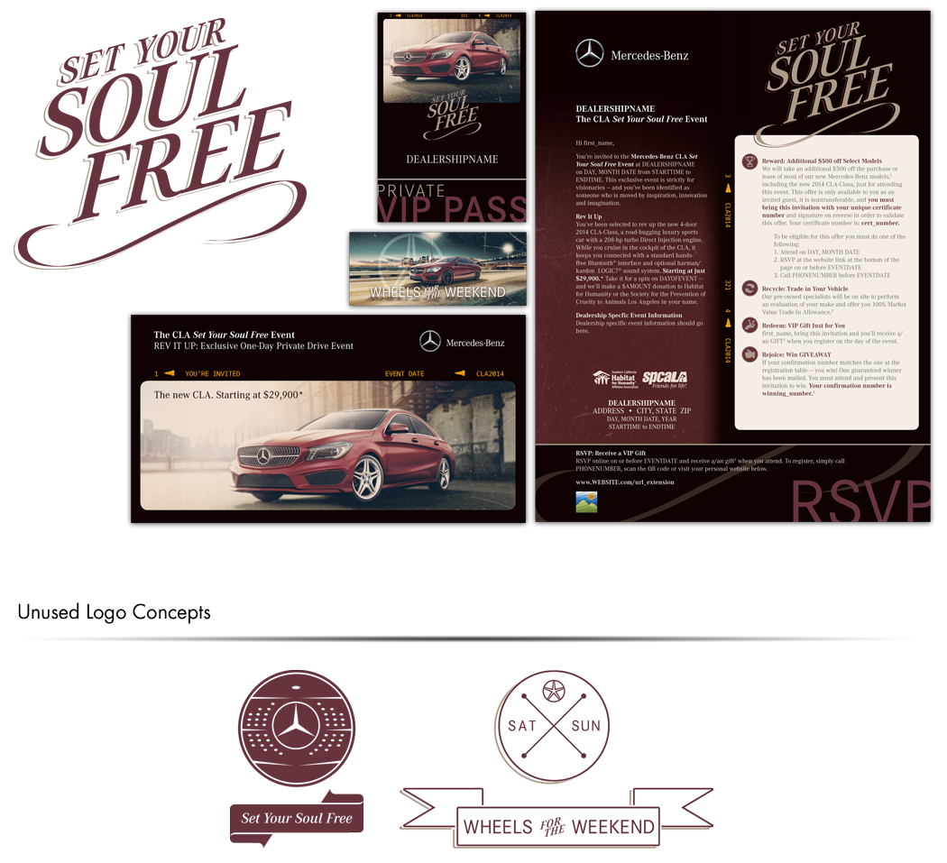
The Mercedes-Benz CLA Set Your Soul Free Event collateral was created for a specific region of the American market. The name of the event was provided by Mercedes-Benz, but the logo design, photo filtering, color choices, and design were all original. Vehicle images for these pieces were filtered like Instagram photos as the target demographic was Gen-Y and more entry-level buyers. The campaign featured a mail piece, optional VIP event pass, registration emails and website, social media components, digital ads, and online contest images.
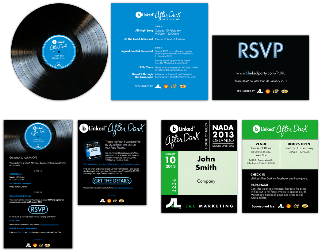
bLinked® After Dark was held by J&L Marketing, Inc. at NADA 2013. The party promotion and execution required a number of pieces, both print and digital. The party was held at the House of Blues and the collateral was designed from the ground up to have a bluesy/concert feel. The words "After Dark" were modeled after B.B. King's handwriting, taken from sample autographs and letters. The 'neon' text was specially created using a combination of Illustrator and Photoshop. At the top, you see the physical invitation, a combination of die-cut record, 'liner notes' invitation and RSVP card with neon text.
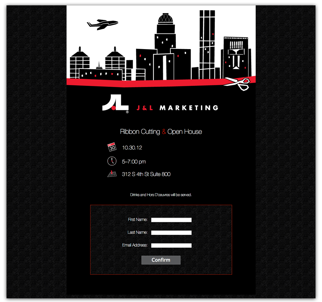
This party RSVP site was created for the celebration of the opening of a new sales office. The charge was to design something with a 'Mad Men' theme using the skyline of downtown Louisville. The graphic was an original illustration.
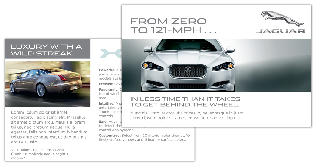
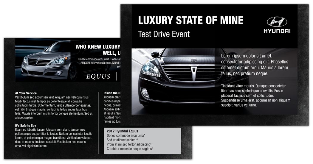
These two mailers were created for higher-end vehicles. Each featured two medium postcard-sized pages printed on heavy stock and mailed in an invitation envelope.
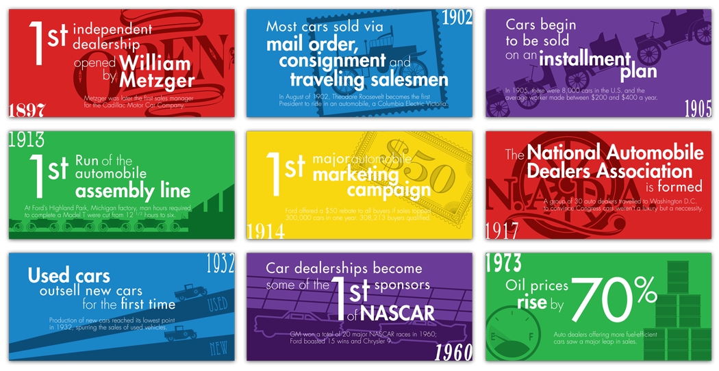
These milestones with original illustrations were created for use on the company Facebook page. They are designed to the pixel dimensions of a two-column 'milestone' on Facebook's timeline. They highlight some of the more dealership-related facts in automobile history.
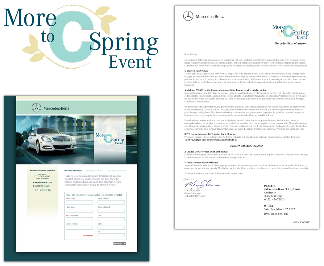
I was charged with adding a new energy to the More to C promotion for some Mercedes-Benz dealerships. I used a similar logo layout to previous years, but chose the photo, colors, and added some springy, yet sophisticated leaves as detail.
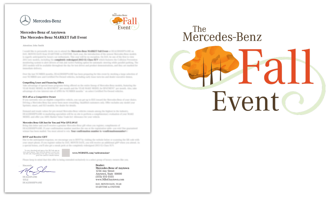
Much like the 'More to C' event, the Mercedes-Benz Fall Event was in need of a logo. I toyed with leaves and with fall colors alone, but I wanted to represent more of the feel of fall without being terribly literal. The swoosh is meant to invoke a sense of cooler winds and the grove of trees is indicative of the market for which this was created, the Northeast Region.
This design was approved for use by the NE market, but later changed by MB corporate.
This design was approved for use by the NE market, but later changed by MB corporate.
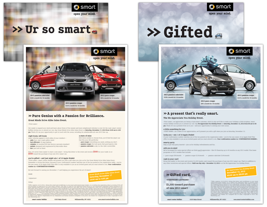
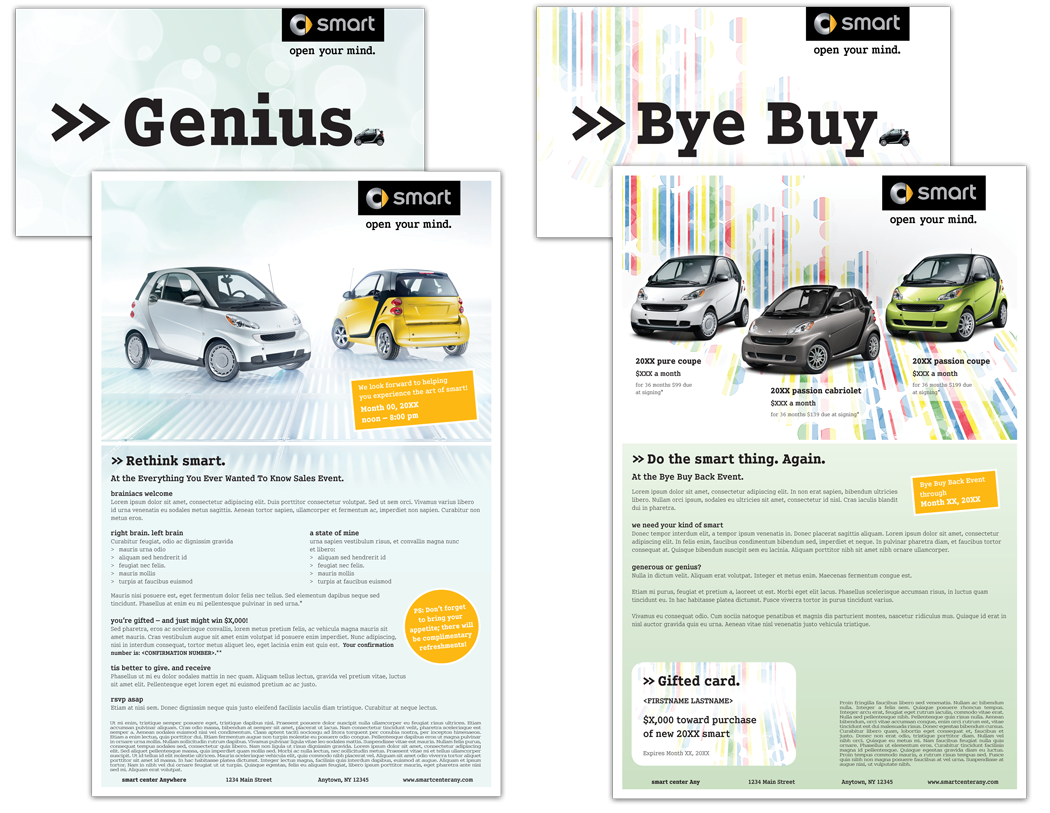
Self-mailer for smart (most current above, previous below). These are so much fun because I get to choose the car colors and poses and arrange them myself. I also get to design the backgrounds and choose the main text background color. On the mailer top right, I got to put a bow on a car. It was a rite of passage.
Note: copyrights property of their respective owners.