
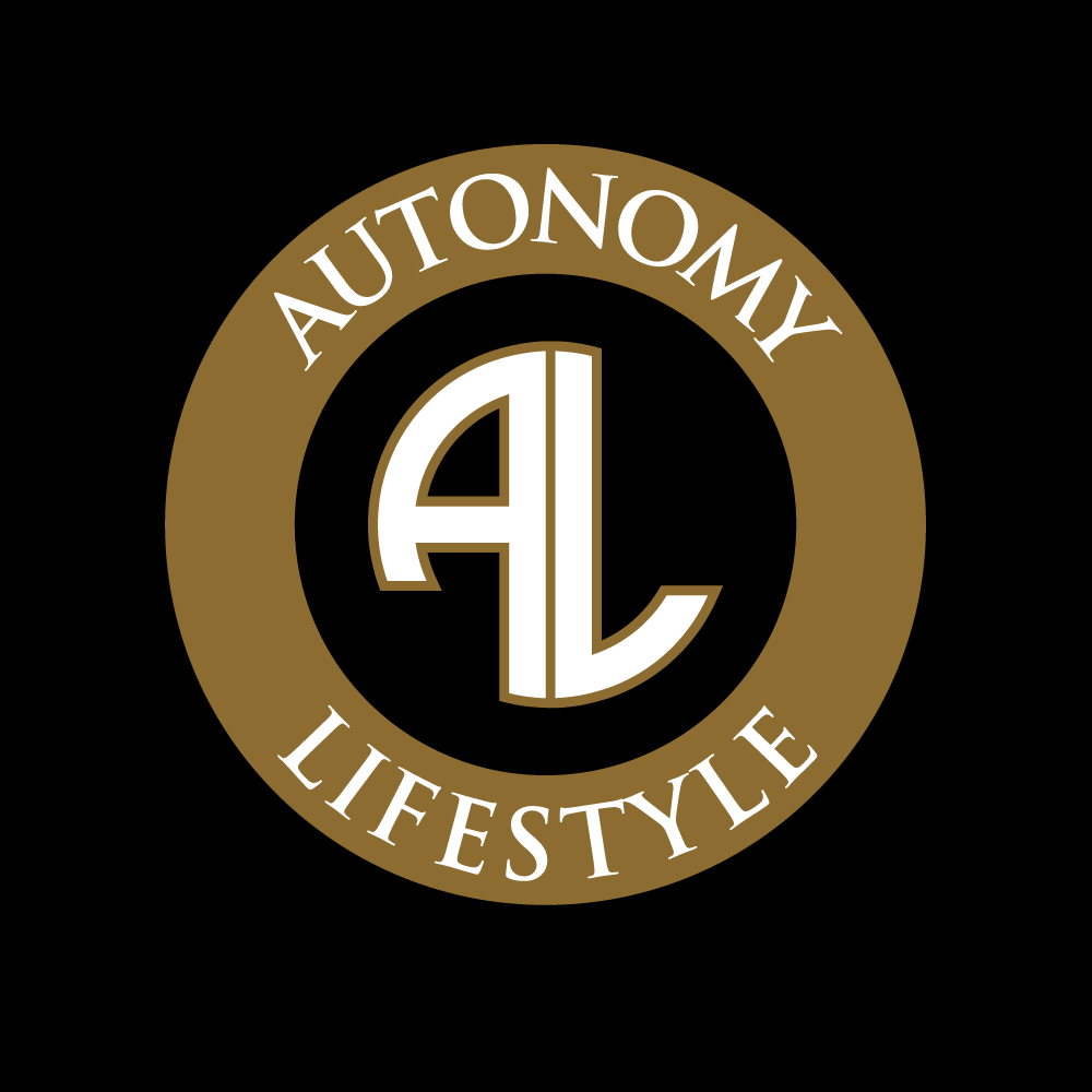
This client is a personal trainer/fitness consultant. He wanted a classic, but powerful look.
Client Logos and Concepts

This logo was commissioned by a metalworker and jewelry artist who draws on vintage inspiration and uses pieces of metal from old cars in her work. I enjoyed creating something so tailored to the feel of her work.
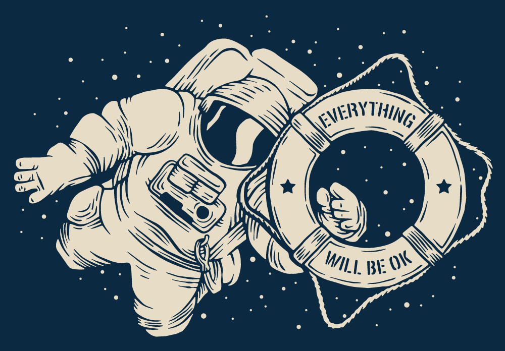
This graphic was commissioned for the Everything Will Be OK Project, a mental health awareness group in Louisville, Kentucky.
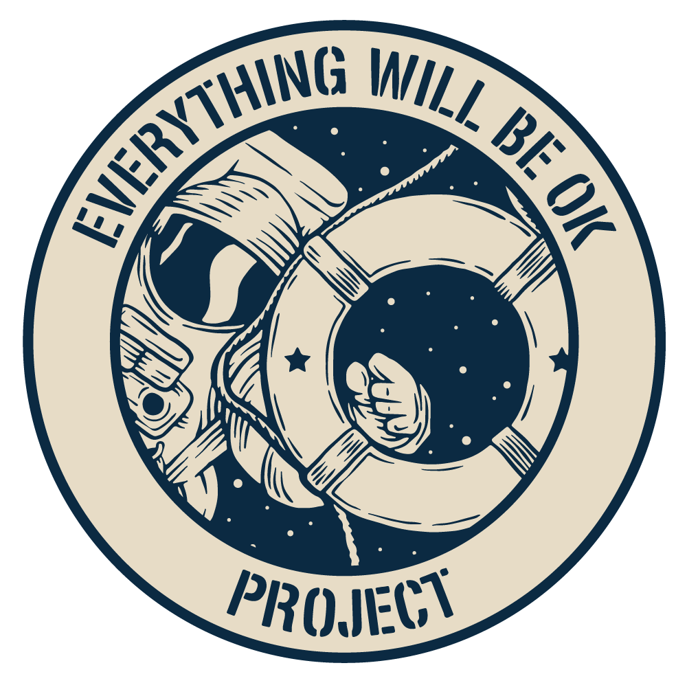
This was the 'logo' version of the Everything Will Be OK Project graphic.
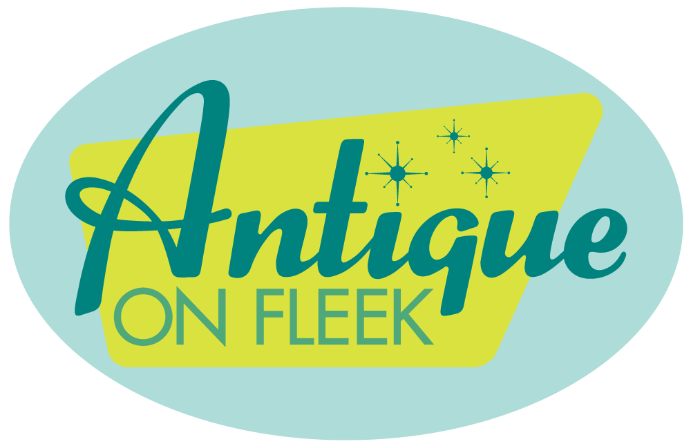
The client wanted a logo for her vintage and vintage-inspired online store.
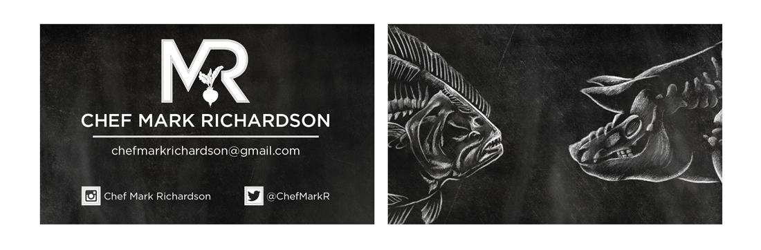
This personal branding (and business card) was created for a chef. The client wanted the 'x-ray' chalk drawings on the back and these were created from scratch with a chalk brush in Photoshop.
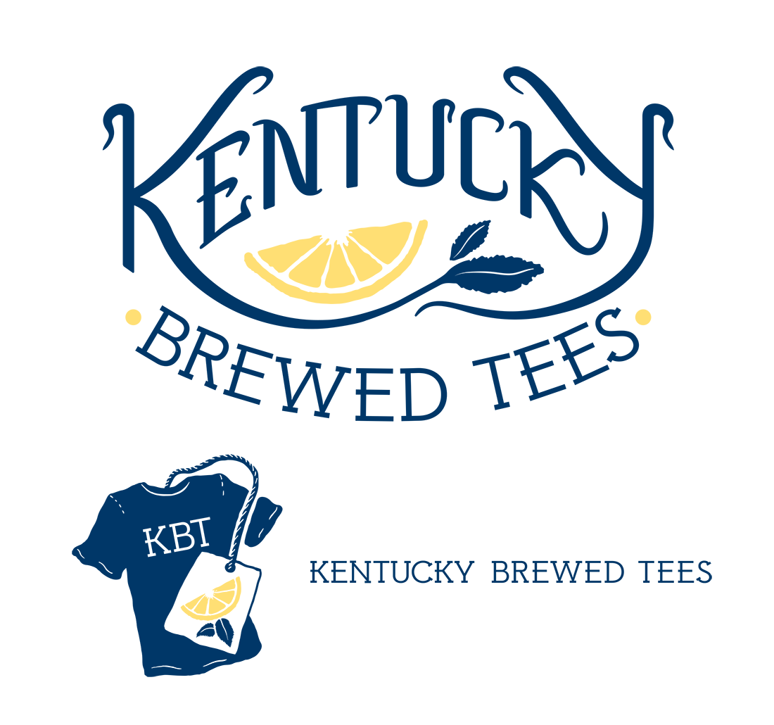
Kentucky Brewed Tees was a screenprinter out of Kentucky, now called Southern Brewed Tees. I did some tee designs for them and they asked me to help rebrand their store. We settled on this hand lettered logo, a t-shirt tea bag icon for social media, and a custom type name.
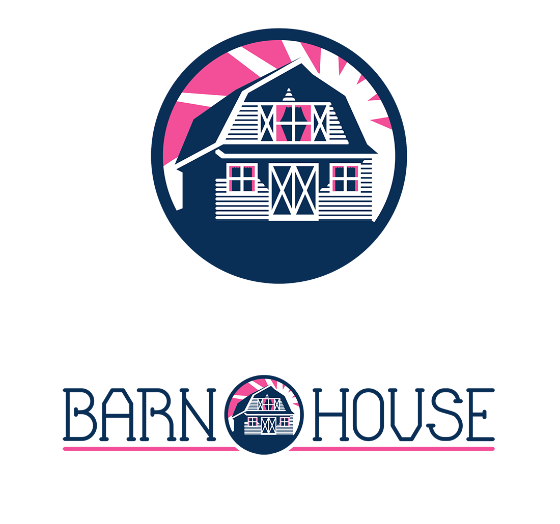
Barn House is a children's clothing line with a 'preppy' but homespun feel. The client wanted navy and pink. I created the image of the barn house and a custom typography for the logo.
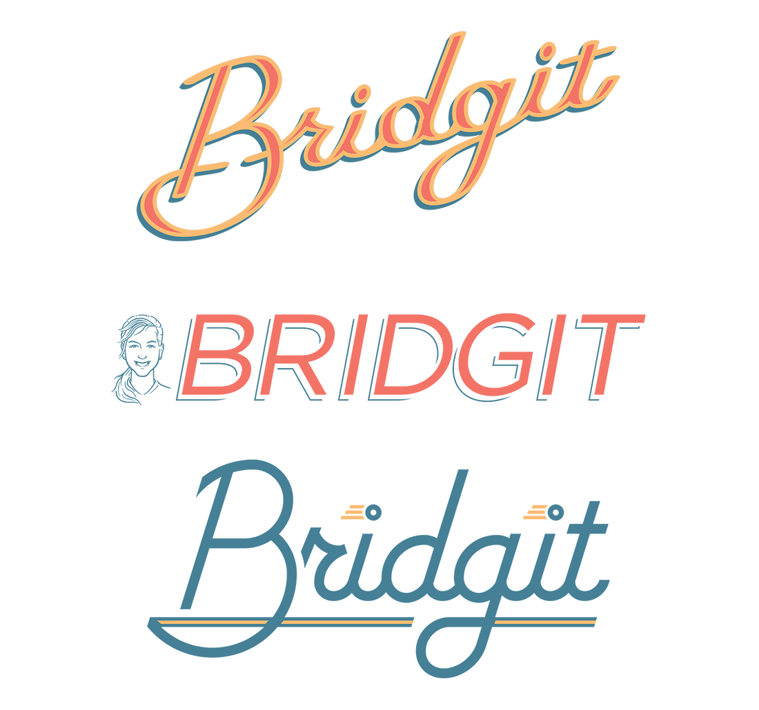
Bridgit was a tentative name for a 'fast pass' toll system crossing river bridges. I was asked to present a more feminine perspective to reflect the name. I did a number of options, including hand lettering and a 'spokesperson' design. These logos were not chosen to go on from the over 50 options.
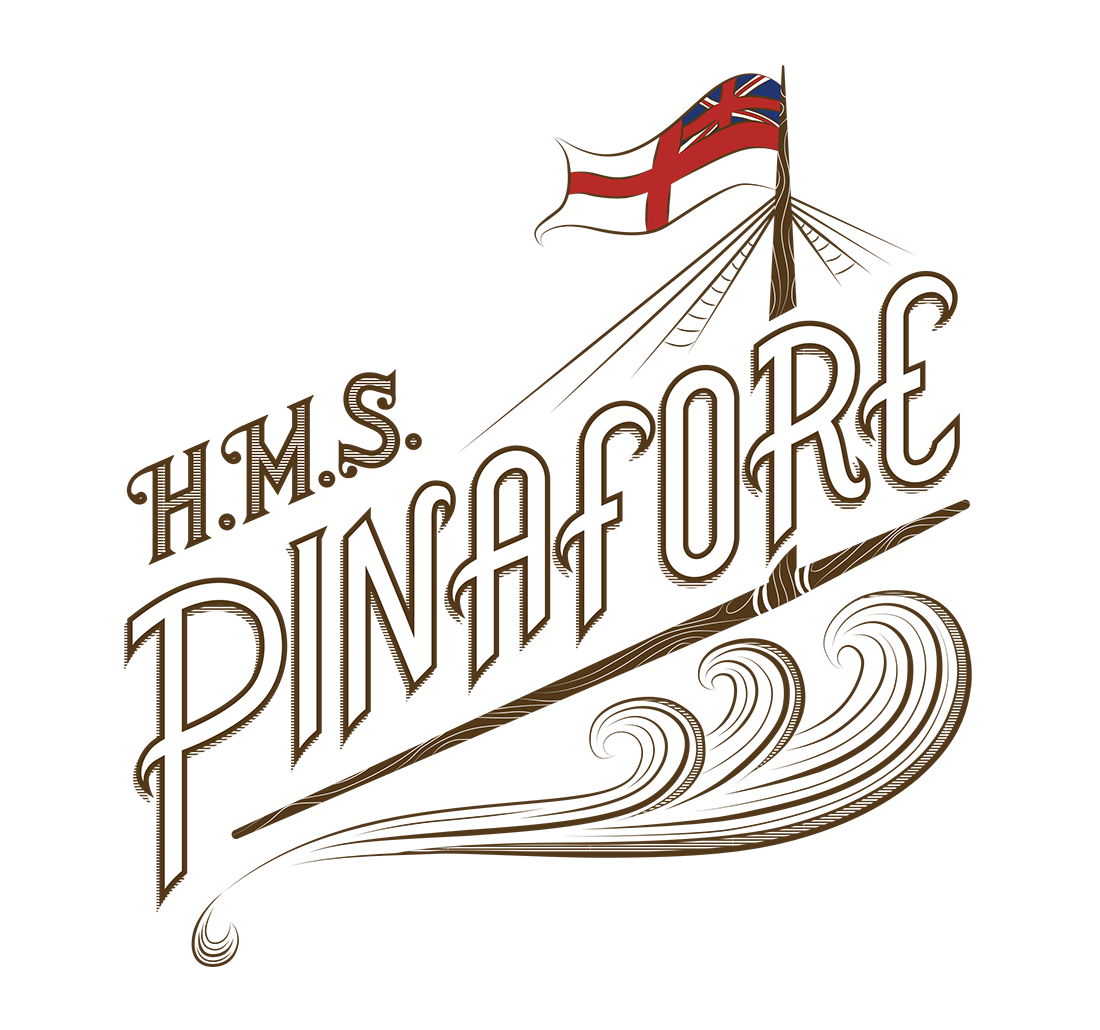
This logo was created for the Gilbert & Sullivan Society of Louisville for their 2015 production of H.M.S. Pinafore. I created the type and built a ship/water-themed embelishment around it. I was going for a 1900's feel as per the client.
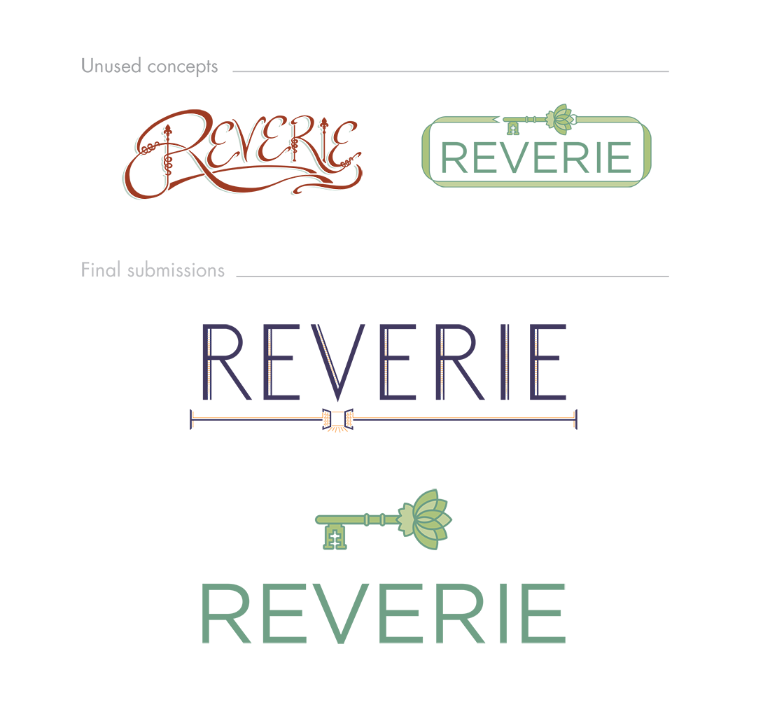
I was asked to create two logo concepts for a loft hospitality/event space called Reverie. This logo needed to indicate meditation and transparency and was to indicate a special place to make memories. The final submissions did that in different ways. The indigo and tangerine logo features custom lettering in the colors of dusk and dawn with a dreamy open window motif. The 'key' version features meditative colors and the peaceful lotus while intimating the idea of a 'secret garden' type retreat.
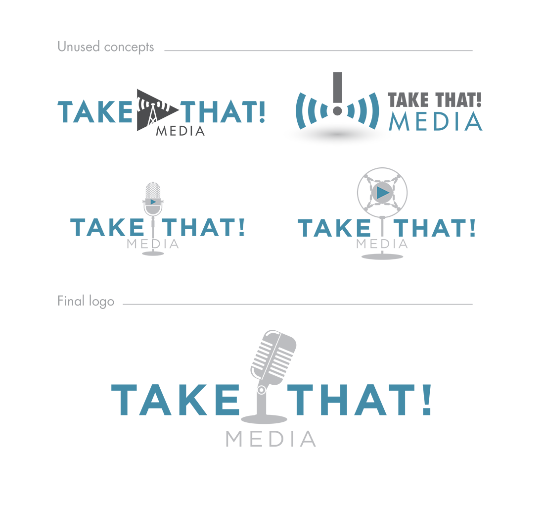
Take That Media wanted branding that conveyed a grasp of new media, specifically podcasting. I tried to combine what we know of new media and the iconography of traditional media. The final logo was sent with a brand guidelines document.

Above you see an unused concept for Carnivore Media featuring the always awesome T-Rex. Also featured, the current logo for the Classical Revolution group in Louisville, Kentucky. The 8th note/fleur de lis was hand sketched and rendered in vector format. The client was searching for something that combined the calligraphic attitude of classical music with a crisp modern twist.