
Contest Entries

I had planned on entring the contest for an In-Space Manufacturing logo, but I chose to merely create the logo for fun. My opinion on contests has changed of late and I didn't feel it was best to participate.

This logo was created for the Everglades Nation logo competition. I struggled a bit with this logo as I have never had the pleasure of visiting the Everglades. I spoke with some friends who lived in the area and they helped me brainstorm what you see. Plant and animal come together, supported by the caring hands of we the conservationists. A mighty cypress roots in the background, framing a heron who explores the sawgrass prairie. One of the contest's stipulations was that the logo be translatable into one color. Thus you see the one-color green version at the bottom. This was created in Illustrator.
Various Logos
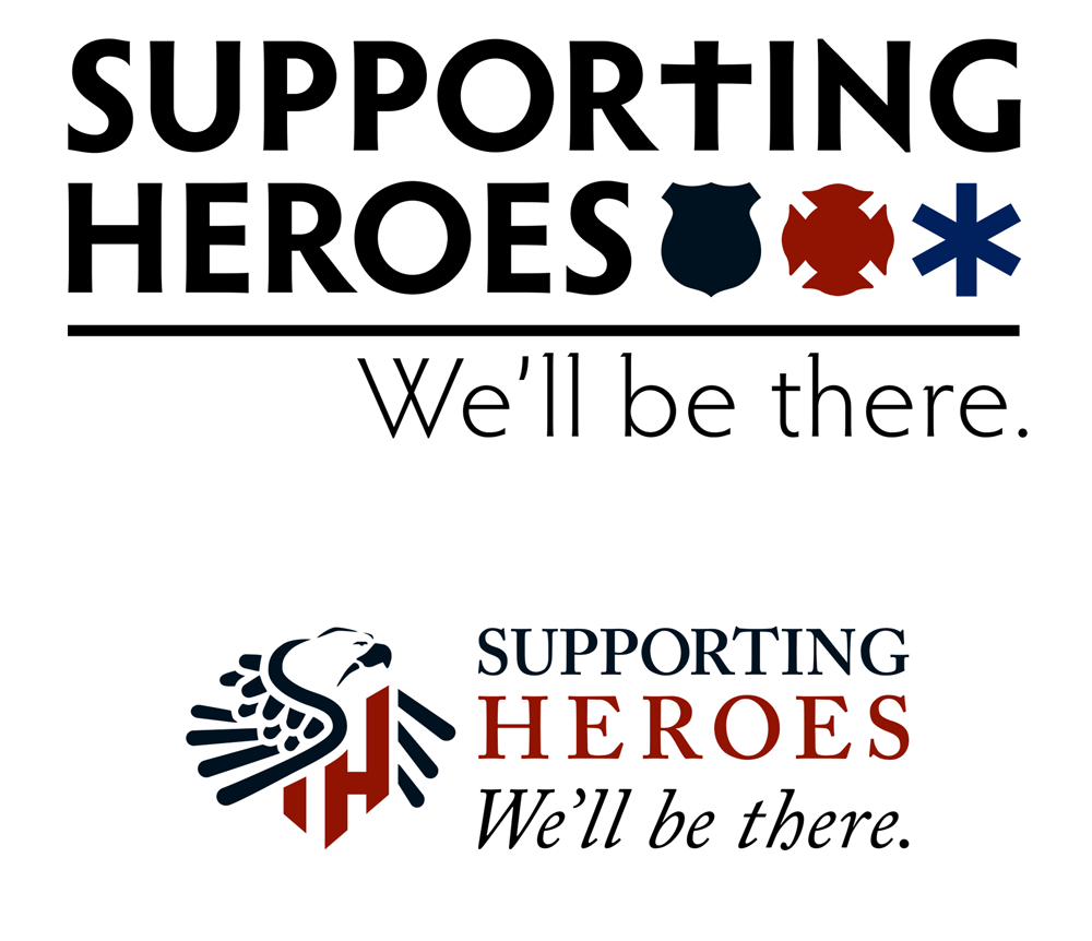
Supporting Heroes is an organization that honors fallen public servants by assisting their families in time of need and grief. This organization was chosen by the local Advertising Federation chapter as a recipient of Dream Team assistance. These logos were created and presented to the charity as an alternative to their current logo. The organization was uncomfortable making a branding change, thus, they were not used.
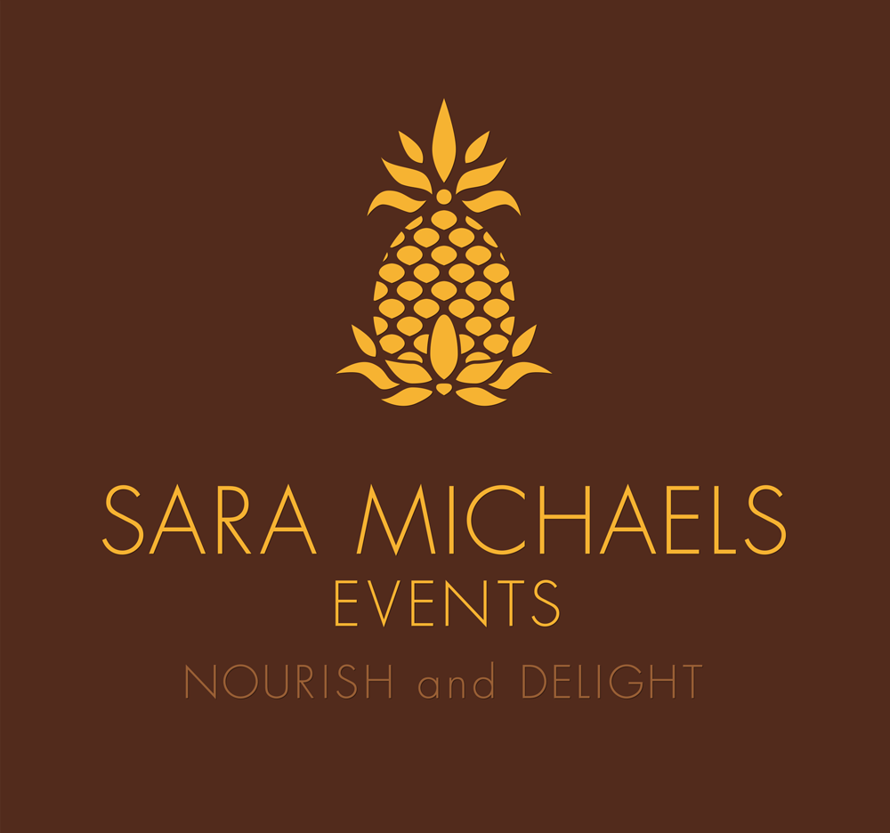
The client was searching for a modern 'colonial' feel with this logo and requested the pineapple. Rich brown, reminiscent of smooth chocolate, and a toasted gold add an enticing palette.
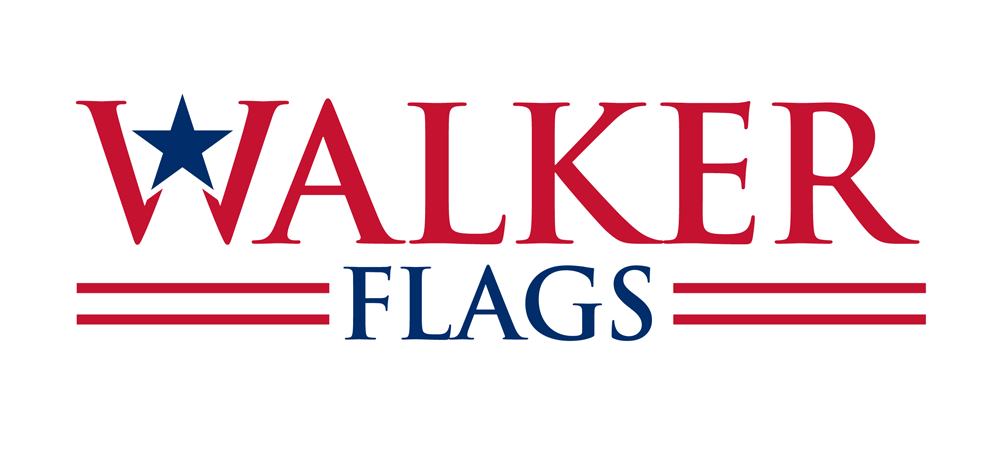
Walker Flags, formerly Colonel Walker Flag Company is a business in Kentucky run by the Walker family sisters and their matriarch. Recently, they decided to revamp their image and asked me to create a company logo under the new name. The 'American' theme was important as to keep loosely with the theme of their original logo. I chose Trajan for the typeface for its cleanliness and stability. The logo is strong and sleek, but traditional enough to appeal to more discerning clients. I believe it presents confidence, something very important for a small business today.
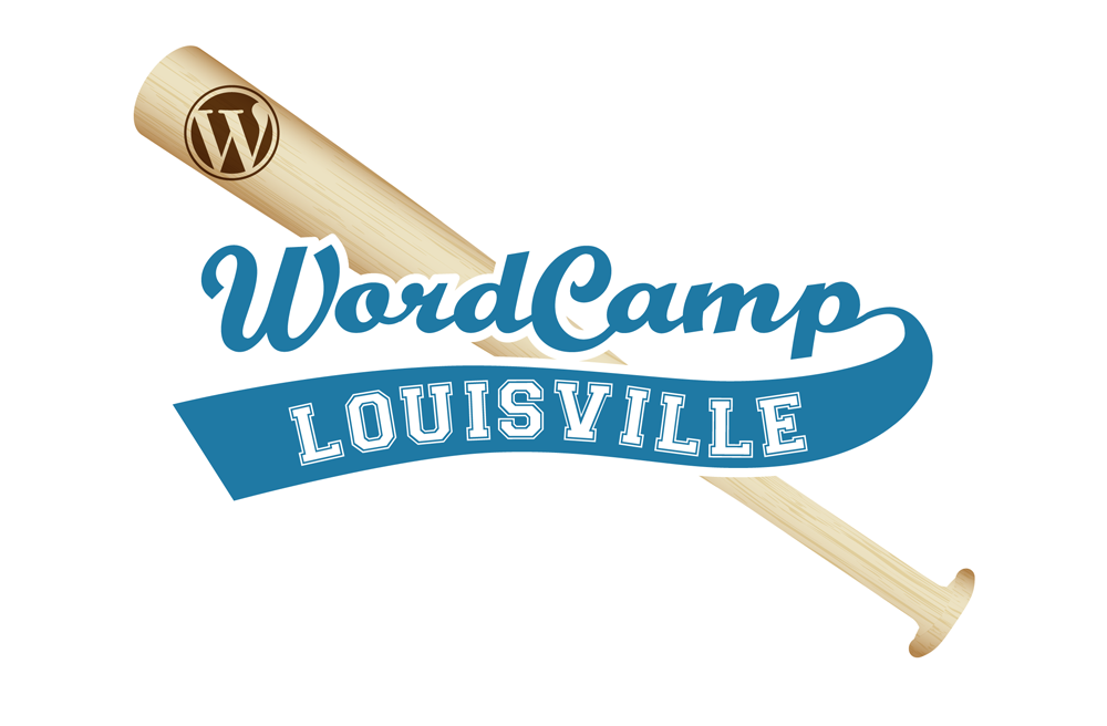
Louisville is known as the home of the Kentucky Derby. If you've ever been to the fair city, you may have also noticed a plethora of fleur-de-lis around town. Both of these things are used as graphic elements in a lot of Louisville-themed logos. The client for this logo suggested a bat because of Louisville Slugger. I jumped at the chance to use something different to showcase Louisville and so this logo was born. I know it's easy to get bogged down in tired trends. Working on this logo gave me a chance to break the stereotypical chains and hit one out of the park!
WordCamp is an event held all over the world for devotees of WordPress.
WordCamp is an event held all over the world for devotees of WordPress.
Various Projects
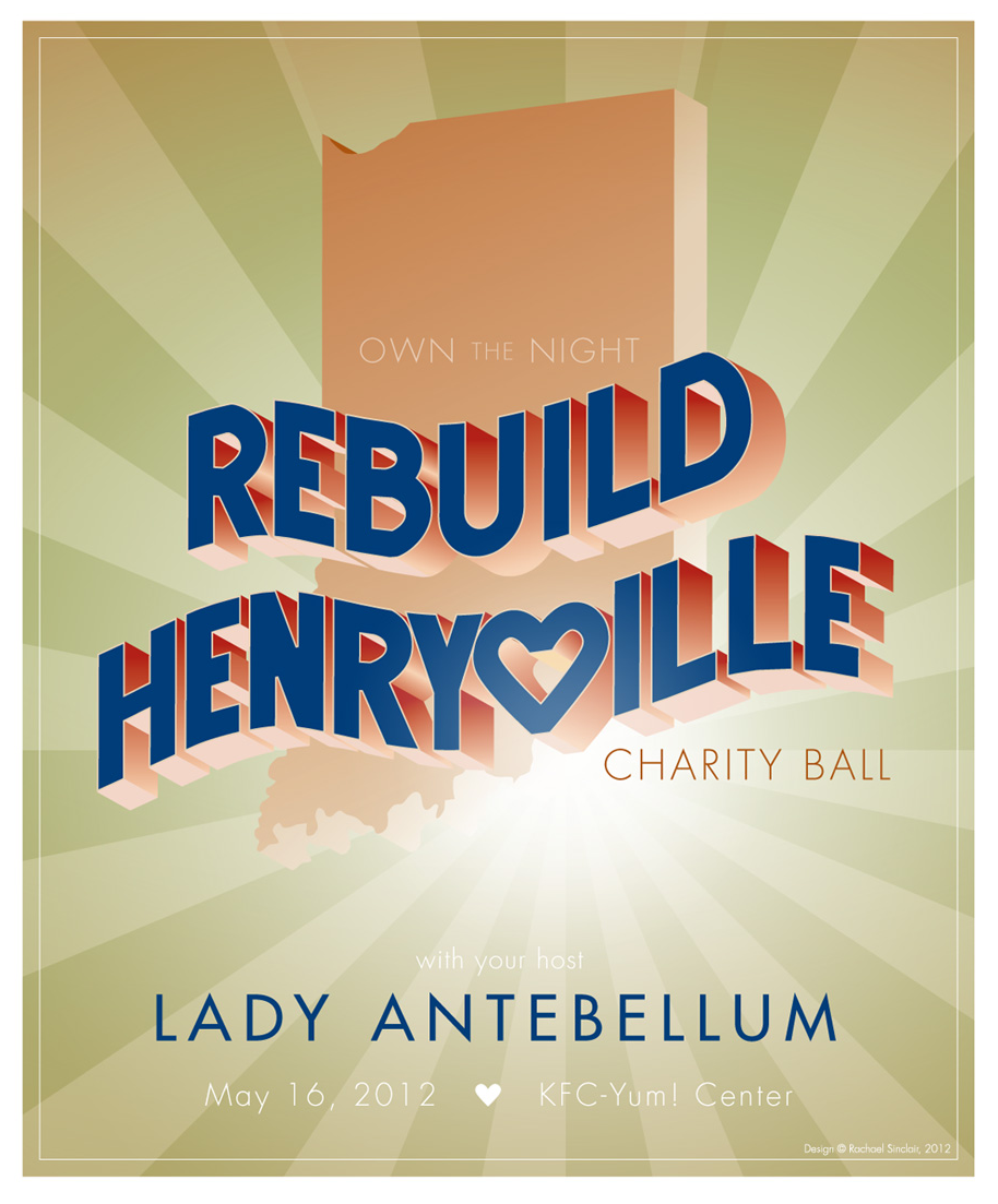
In March of 2012, a series of storms moved through Kentucky and Indiana. These storms left a gash of devastation and loss, nearly wiping Henryville, Indiana off the map. Weeks later, Lady Antebellum held a contest, calling for high schools to send them videos explaining why the band should play at their prom. Another Indiana school used their video to advocate for Henryville High School. The band chose Henryville High, but couldn't play prom due to a scheduling conflict. This poster was created for another Lady Antebellum contest, this one to choose the poster for their benefit concert. I used warm 'heartland' colors in the design. The 'Rebuild Henryville' text was sketched and translated in Illustrator to fit specifically across Indiana, the heart-shaped 'V' placed over Henryville.
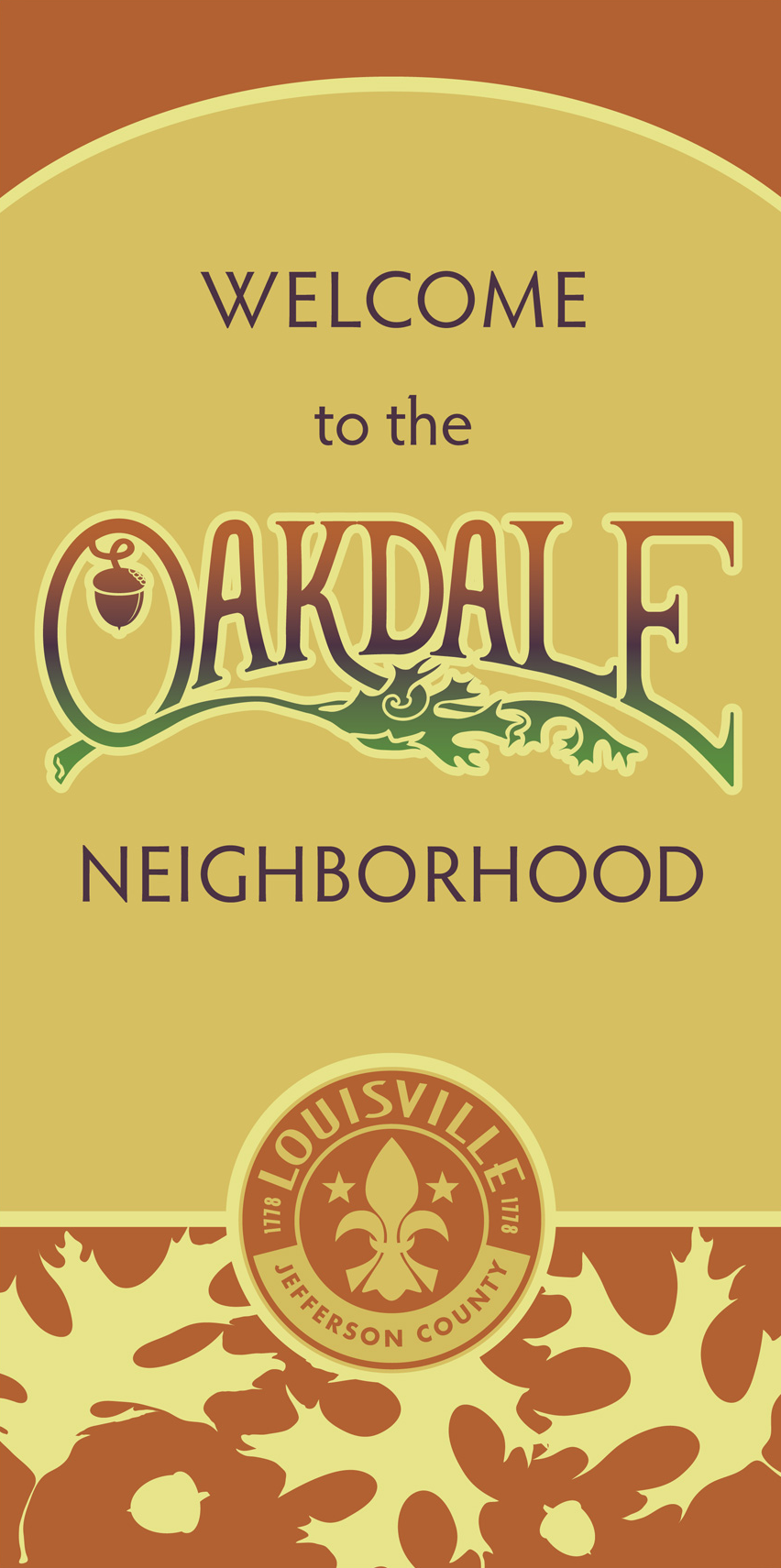
I was asked to create this banner for the Oakdale neighborhood in Louisville Kentucky. The council wanted something that incorporated an acorn. I went a step further and used oak leaves and a color scheme taken directly from an acorn I picked up on a walk. The word 'Oakdale' was hand drawn and digitized.